Mismatched ship interiors look cheap and cause strict shipyard rejections. Frustrated with inconsistent cabin designs ruining your profits? I will show you exact methods to align panel and door finishes perfectly.
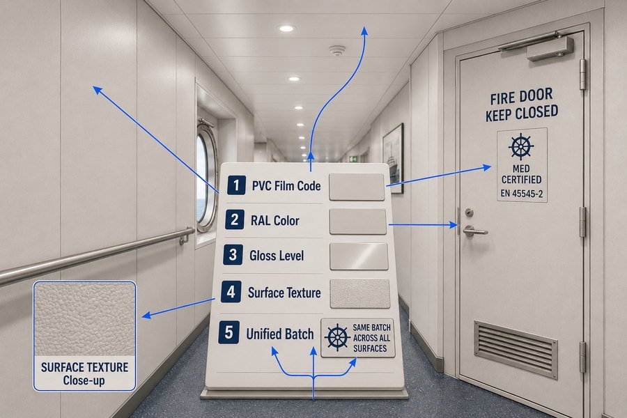
To match finishes across marine wall panels, ceiling panels, and fire doors, you must coordinate PVC film codes, RAL color standards, gloss levels, and surface textures. Ensuring exact color codes and ordering from unified batches prevents visual discrepancies and meets strict European and US shipyard interior standards.
Let's explore the specific steps to align your marine ceiling and wall finishes perfectly, ensuring you never face shipyard client rejections over color clashes again.
How to match marine wall panel finishes with marine ceiling panel finishes?
Ceiling and wall panels often come from different production lines. If their whites clash, the cabin feels small and dirty. Here are the precise ways to match them.
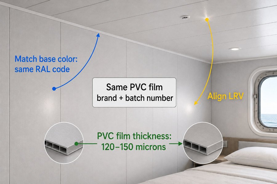
Matching marine wall and ceiling panels requires aligning three core elements: base color using RAL standards, PVC film thickness ranging from 120 to 150 microns, and light reflectance values (LRV). You must specify the same PVC film brand and batch number for both panel types.
Understanding these three elements is crucial, so let's break down exactly how you control base colors, film thickness, and light reflectance during your purchasing process.
Standardizing Base Colors with RAL Codes for Marine Panels
When I buy marine panels, the first rule is to never use vague names like "warm white" or "ivory." You must use a universal standard. The RAL color system is the industry standard for marine interiors. For example, RAL 9010 (Pure White) and RAL 9016 (Traffic White) look similar but will clash horribly if placed next to each other. Wall panels usually use a matte finish, while ceiling panels might use a slight gloss. Even with the exact same RAL code, the gloss difference can trick the eye1. Therefore, I always specify a gloss level of 20% to 30% for both walls and ceilings to keep the base color looking identical under cabin lights.
Specifying PVC Film Thickness and Brands for Ceilings and Walls
Marine panels are steel sheets laminated with PVC film. To get a perfect match, you need to control the PVC film itself. The standard thickness for marine PVC film is between 120 and 150 microns. If your ceiling panel uses a thin 100-micron film and your wall panel uses a thick 150-micron film, the underlying steel texture will show through differently2, causing a visual mismatch. Furthermore, you must force your panel factories to buy from the same film brand, such as LG Hausys or a verified local Asian brand. Different brands have different ink formulas for the same pattern.
Controlling Light Reflectance Values (LRV) in Ship Cabins
Light Reflectance Value (LRV) measures how much light a surface reflects. According to standard marine illumination guidelines, crew cabin ceilings should have an LRV of 80% to 90%. Wall panels usually need an LRV of 60% to 70%3. If you use the exact same bright white finish for both, the cabin might feel too glaring. To match them beautifully, I often use a very bright RAL 9016 for the ceiling and a slightly softer RAL 9010 for the walls. They belong to the same color family, so they match perfectly, but the slight LRV difference makes the room feel taller and more comfortable for the crew.
| Matching Element | Specification Range | Authoritative Standard/Source | Key Benefit |
|---|---|---|---|
| Base Color | RAL 9010 or RAL 9016 | RAL gGmbH Color Standards | Eliminates visual color clashes |
| PVC Film Thickness | 120 to 150 microns | IMO FTP Code Part 5 (Low Flame Spread) | Ensures uniform surface texture |
| Light Reflectance (LRV) | 80%-90% for Ceilings | Marine Interior Illumination Guidelines | Reduces glare and crew fatigue |
Now that walls and ceilings match, we must ensure the heavy fire doors do not break this delicate visual harmony.
How to match marine wall panel finishes with marine fire door finishes?
Fire doors have heavy steel cores, unlike lightweight wall panels. This material difference often causes severe color mismatch. I will show you how to blend doors into walls perfectly.
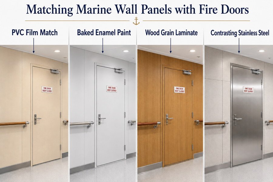
You can match marine wall panels and fire doors using four methods: applying identical PVC film laminations, using precisely matched baked enamel paint, selecting matching wood grain laminates, or adopting contrasting stainless steel finishes. These methods bridge the gap between composite panels and heavy steel doors.
Fire doors are tricky because of their thick steel skin, so let's examine how each of these four matching methods works in actual shipyard project practice.
Applying Identical PVC Film to Marine Walls and Fire Doors
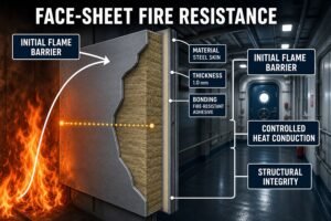
The most direct way to match a fire door to a wall panel is to cover both with the exact same PVC film. Fire doors are made of galvanized steel sheets, usually 0.8mm to 1.2mm thick. Factory workers can laminate the same 150-micron PVC film used on your wall panels directly onto the door leaf. I have used this method many times. It adds about $5 to $8 per square meter to the door cost, but it guarantees a 100% color and texture match. However, you must ensure the adhesive used on the door can withstand high temperatures, as marine fire doors must pass the strict IMO A-60 or B-15 fire tests.
Using Baked Enamel Paint to Match Marine Panel Colors
Sometimes, PVC film on a door is easily scratched by luggage or cargo carts. In these cases, baked enamel paint, also known as powder coating, is a better choice. To match the painted door with a PVC-laminated wall panel, you must send a physical cut sample of the wall panel to the door factory. The factory will use a digital color scanner to mix the paint. The paint thickness should be between 60 and 80 microns. While paint lacks the soft texture of PVC film, a precise RAL match using powder coating provides a highly durable surface that blends well with solid-color wall panels.
Selecting Wood Grain Laminates and Stainless Steel Finishes
When designing officer cabins, we often use wood grain patterns. Matching wood grain PVC film on walls with painted doors looks terrible. You must use high-pressure laminates (HPL)4, like Formica or Wilsonart, on both the wall panels and the fire doors. For areas like galleys (kitchens) or wet units, matching colors is impossible due to moisture. The best method here is to use contrasting stainless steel finishes. A wall panel might be a light grey, but installing a Grade 304 or 316L stainless steel fire door5 provides a clean, professional, and compliant finish that does not need to match the wall color.
| Matching Method | Best Application Area | Estimated Cost Impact | Durability |
|---|---|---|---|
| Identical PVC Film | Standard Crew Cabins | +$5 to $8 per sqm | Medium |
| Baked Enamel Paint | High-Traffic Corridors | Standard Cost | High |
| Wood Grain HPL Laminate | Officer Quarters / Lounges | +$15 to $25 per sqm | High |
| Stainless Steel (304/316L) | Galleys / Wet Units | +$40 to $60 per door | Very High |
Matching materials is only half the battle; next, we must look at the overall ship interior design consistency across the whole deck.
How to create consistent ship interior design with marine panel finishes?
A messy ship interior ruins the perceived value of the whole vessel. Tired of disjointed cabins that anger your buyers? Use these design rules to maintain strict consistency across all deck levels.
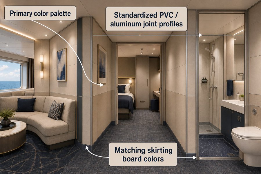
Creating a consistent ship interior design involves unifying three factors: establishing a primary color palette, standardizing joint profile finishes using PVC or aluminum, and matching skirting board colors. Applying these three rules ensures seamless visual transitions between public spaces, crew cabins, and wet units.
Consistency does not happen by accident in a shipyard. We need to dissect these three design factors to understand how they hold the entire cabin look together.
Establishing a Primary Color Palette for Ship Interiors
When I help clients plan a ship's interior, I always enforce the 60-30-10 color rule6. This means 60% of the room should be a dominant primary color, 30% a secondary color, and 10% an accent color. For marine interiors, the 60% is always the wall panels. You must establish a primary palette that runs through the entire ship. If Deck A uses RAL 9010 (Pure White), Deck B should not suddenly switch to a heavy beige. A unified primary palette makes the ship feel like one cohesive vessel7, not a collection of random rooms. I usually recommend a soft white or light grey as the primary 60% base for all developing country shipyards because it is safe and widely accepted by US and European owners.
Standardizing Marine Panel Joint Profile Finishes
Marine wall panels are typically 50mm thick and connect using H-profiles. If your panels are beautiful but your joint profiles are ugly, the design is ruined. You have two main choices: PVC profiles or aluminum profiles. PVC profiles are cheap, costing about $1.00 to $1.50 per meter, and can be wrapped in the exact same film as the panels. This makes the joints invisible. Aluminum profiles cost more, about $2.50 to $3.50 per meter, and are usually painted. To maintain consistency, you must strictly standardize the profile type. Do not mix PVC joints in one room and aluminum joints in the next room.
Matching Skirting Boards for Seamless Cabin Transitions
Skirting boards sit at the bottom of the wall panels, connecting the wall to the marine floor deck. They are usually 100mm in height. A major mistake I see is using black skirting boards in a room with light wood walls and light grey floors. It cuts the room in half visually. To create a seamless transition, the skirting board should match either the wall panel finish or the floor finish. I often use stainless steel skirting boards because they resist mop water and physical impacts8, and their neutral metallic tone provides a consistent baseline across every single cabin and corridor on the ship.
| Design Factor | Common Material Choice | Cost Estimate | Primary Function |
|---|---|---|---|
| Color Palette Base | RAL 9010 or RAL 7035 | N/A (Included in panel) | Unifies overall ship appearance |
| Joint Profiles | PVC or Painted Aluminum | $1.00 - $3.50 per meter | Connects panels seamlessly |
| Skirting Boards | 100mm Stainless Steel | $4.00 - $6.00 per meter | Protects walls, bridges floor design |
With a consistent structural layout in place, the specific color choices for different ship areas become our next major focus.
How to choose marine panel colors for ship cabins and corridors?
Dark corridors feel cramped, and loud cabin colors increase crew stress. Unsure which colors work best? These specific color selection rules will solve your layout problems immediately.
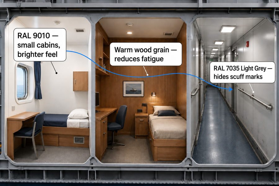
Choose marine panel colors based on space function and lighting: use high-reflectance light colors like RAL 9010 for small crew cabins, warm wood grains for officer quarters to reduce fatigue, and durable mid-tones like RAL 7035 Light Grey for high-traffic corridors to hide scuff marks.
Choosing the right color is a mix of human psychology and physical practicality, so let's look at exactly why we assign these specific colors to cabins, officer quarters, and corridors.
Selecting Light Colors for Standard Crew Cabins
Standard crew cabins on commercial ships are very small, often only 6 to 9 square meters. If you use dark colors here, the space feels like a prison. You must use light colors with a high Light Reflectance Value (LRV greater than 80%)9. RAL 9010 (Pure White) and RAL 1013 (Oyster White) are the best choices. These colors bounce the artificial light around the room, making the ceiling feel higher and the walls wider. In my experience supplying European projects, shipowners strictly reject dark colors in lower deck cabins because it violates basic crew welfare and comfort standards. Keep it bright and keep it simple.
Using Warm Wood Grains for Officer Quarters
Officers and captains spend months at sea and experience high levels of mental fatigue10. A sterile white room feels like a hospital. Therefore, officer quarters and ship lounges require warm, natural tones. Wood grain PVC films, such as cherry, teak, or light oak, are perfect. According to ISO 8846 standard lighting principles, warm colors under 3000K LED lights reduce eye strain and promote relaxation11. I always advise buyers to spend a little extra on high-quality, textured wood grain finishes for these upper-deck rooms. It drastically improves the perceived luxury of the ship interior without adding heavy weight to the bulkheads.
Deploying Durable Mid-Tones in Ship Corridors
Ship corridors are high-traffic zones. Crew members constantly push heavy metal tool carts, luggage, and food trolleys through these narrow spaces. If you use pure white panels in a corridor, they will be covered in black scratch marks within a week. You must deploy durable mid-tones here. RAL 7035 (Light Grey) or RAL 1015 (Light Ivory) are excellent choices. These colors are light enough to keep the corridor safe and visible, but they are dark enough to hide minor scuffs and dirt. This simple choice drastically reduces the shipyard's maintenance costs before the ship is even handed over to the owner.
| Ship Area | Recommended Color / Finish | Specific RAL/Type | Primary Reason |
|---|---|---|---|
| Crew Cabins | High-Reflectance Whites | RAL 9010 / RAL 1013 | Maximizes space and light |
| Officer Quarters | Warm Wood Grains | Cherry, Oak, Teak | Reduces fatigue, adds luxury |
| Corridors | Durable Mid-Tones | RAL 7035 Light Grey | Hides dirt and cart scuff marks |
Knowing the correct colors is great, but executing this plan across multiple product types in one massive project requires careful supply chain coordination.
How to coordinate marine wall panels, ceiling panels, and doors in one project?
Buying panels and doors from different Asian factories leads to delivery chaos and mismatched finishes. Exhausted from chasing multiple suppliers? Centralized project coordination is your best solution.
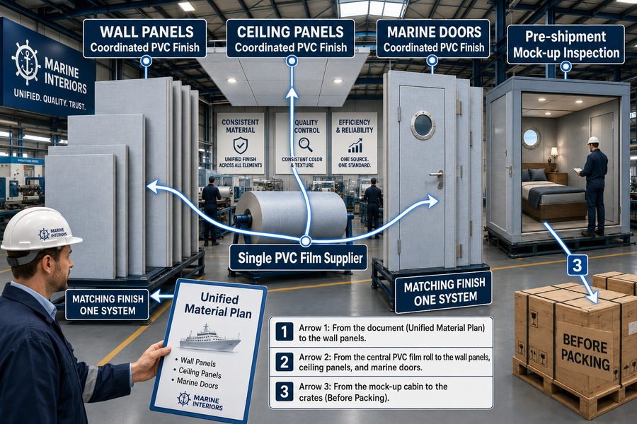
To coordinate panels and doors in one project, you must implement three steps: issue a unified material requisition plan, nominate a single PVC film supplier across all factories, and conduct a consolidated pre-shipment mock-up inspection in the factory before packing.
Let me share how I manage this supply chain process from my factory days, ensuring these three steps prevent massive disasters when the cargo arrives at your shipyard.
Issuing a Unified Marine Material Requisition Plan
You cannot order wall panels in January and fire doors in March and expect them to match. You must issue a unified material requisition plan, also known as a Bill of Materials (BOM). I always tell my clients to finalize all quantities at once. The standard production lead time for marine panels and doors in China or Vietnam is 45 to 60 days12. By issuing one comprehensive purchase order to all your factories simultaneously, you align their production schedules. This forces the panel factory and the door factory to buy their raw steel and surface films in the exact same market window, heavily reducing the chance of material variations.
Nominating a Single PVC Film Supplier for All Factories
This is the most powerful secret in marine outfitting procurement. If Factory A buys film from Supplier X, and Factory B buys film from Supplier Y, your colors will clash. As the buyer, you have the power to nominate the raw material source. You must tell your wall panel factory, your ceiling factory, and your fire door factory to buy their PVC film from one specific supplier, using one specific batch number13. I regularly force factories to share film rolls if the project is small. This completely eliminates the "different brand" variable. You take control of the raw material, and the factories simply perform the lamination work.
Conducting a Consolidated Pre-Shipment Mock-Up Inspection
Never wait until the products arrive in Europe or the US to check the colors. It is too late, and shipping costs are lost. You must demand a pre-shipment mock-up. I always make the factory build a 2-meter by 2-meter corner cabin mock-up on their factory floor. It costs around $500, but it saves thousands. They must install the ceiling, the wall panel, and the fire door together. You then inspect this mock-up via video call or send a local agent. If the door color looks slightly off against the wall under standard lighting14, you reject it at the factory level where it can be fixed cheaply.
| Coordination Step | Execution Method | Typical Lead Time / Cost | Key Outcome |
|---|---|---|---|
| Unified BOM Plan | Order all products simultaneously | 45-60 days production | Aligns factory schedules |
| Nominate Film Supplier | Mandate one specific raw material source | No extra cost | Eliminates brand color variations |
| Factory Mock-Up | Build a 2x2m sample room before shipping | Approx. $500 | Catches errors before export |
Even with good factory coordination, physical color batches can still drift slightly. Let's tackle the final step: preventing scientific color differences entirely.
How to avoid color differences between marine interior products?
Even with the same RAL color code, different production runs cause noticeable color variations. Afraid of sudden shipyard rejection? Here is how to lock down your color consistency permanently.
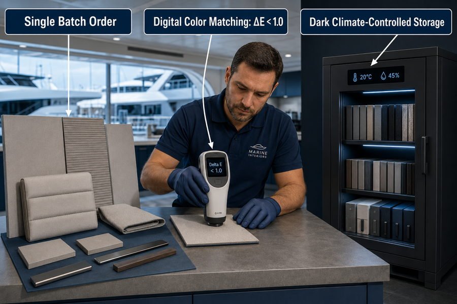
To avoid color differences, you must execute three strict controls: order all products in a single batch, mandate the use of a digital spectrophotometer for color matching to keep Delta E less than 1.0, and store reference samples in a dark, climate-controlled environment.
Color drift is a nightmare for procurement officers, so let us break down how single batch ordering, digital measurement, and proper sample storage eliminate this risk completely.
Ordering Marine Panels and Doors in a Single Batch
Paint and PVC films are mixed in large vats. Vat A will always look slightly different from Vat B, even if the recipe is the same. This is called batch variation. To avoid color differences, you must order your total project requirement in a single batch. Do not split your 5,000 square meter order into five separate 1,000 square meter orders spread over a year. Order the full amount at once. If you lack warehouse space, pay the factory a storage fee to hold the finished goods. Single batch production is the only physical way to guarantee the ink and paint mixtures are 100% identical across all your panels and doors.
Using a Digital Spectrophotometer for Marine Color Matching
Human eyes are easily tricked by lighting and fatigue. You cannot rely on a factory worker saying "it looks the same." You must mandate the use of a digital spectrophotometer. This machine measures color scientifically using the CIE 1976 color space15. It gives a value called Delta E (ΔE), which represents the distance between two colors. A normal human eye can detect a color difference when Delta E is greater than 1.5.16 In my marine outfitting contracts, I strictly specify that the Delta E between the master sample and the mass production must be less than 1.0. If the machine reads 1.2, the batch is rejected.
Storing Reference Samples in Climate-Controlled Environments
Before mass production starts, the factory will send you a master color sample. You sign it and send half back. A common mistake is leaving this sample on a sunny desk. UV rays from the sun will fade the PVC film within weeks.17 When the real products arrive three months later, they will not match your faded sample, causing huge arguments. You must store your signed reference samples in a dark, dry, climate-controlled cabinet. When the final panels arrive from China or Vietnam, you take the pristine sample out of the dark box to compare. This ensures your baseline standard never changes.
| Control Measure | Tool / Strategy | Industry Standard | Primary Benefit |
|---|---|---|---|
| Single Batch Ordering | Consolidate POs | One production run | Eliminates chemical mixture drift |
| Digital Spectrophotometer | Delta E (ΔE) Measurement | ΔE < 1.0 | Removes human visual error |
| Sample Storage | Dark, Climate-Controlled Box | Zero UV Exposure | Prevents reference fading |
Conclusion
Matching marine panels and doors requires strict RAL color codes, unified film suppliers, and digital batch control. Follow these exact steps to deliver flawless ship interiors and maximize your project profits.
-
"Surface gloss and color perception of 3D objects - PMC - NIH", https://pmc.ncbi.nlm.nih.gov/articles/PMC2538579/. Research on colour appearance and surface gloss shows that perceived lightness and colour can change with surface finish, illumination, and viewing geometry, supporting the claim that two surfaces with the same nominal colour may appear different when gloss differs; it does not validate the article’s specific 20%–30% gloss recommendation. Evidence role: mechanism; source type: paper. Supports: Even with the exact same RAL code, the gloss difference can trick the eye.. Scope note: Supports the perceptual mechanism, not the specific gloss percentage range prescribed in the article. ↩
-
"[PDF] A photometric method for measuring the hiding power of paints.", https://nvlpubs.nist.gov/nistpubs/nbstechnologic/nbstechnologicpaperT306.pdf. Coatings and film-optics literature describes how film thickness, opacity, and substrate roughness influence hiding power and surface appearance, supporting the mechanism that different laminate thicknesses can reveal or mask the substrate differently; the evidence is general to coatings and films rather than specific to marine PVC-faced steel panels. Evidence role: mechanism; source type: paper. Supports: If ceiling and wall panels use PVC films of different thicknesses, the underlying steel texture can show through differently and create a visual mismatch.. Scope note: Contextual support from coating or film science; it may not directly test the exact 100-micron versus 150-micron marine panel example. ↩
-
"[PDF] Lighting Design Manual", https://www.cfm.va.gov/til/dManual/dmLighting.pdf. Lighting-design guidance commonly recommends high ceiling reflectance and moderately high wall reflectance to improve interior illumination distribution and visual comfort, which supports the stated ceiling and wall LRV ranges as design-context values; the support is indirect if the source addresses buildings or general interiors rather than ship crew cabins specifically. Evidence role: expert_consensus; source type: government. Supports: Crew cabin ceilings should have an LRV of 80% to 90%, while wall panels usually need an LRV of 60% to 70%.. Scope note: May support general interior lighting reflectance ranges rather than marine-specific cabin requirements. ↩
-
"High-Pressure Decorative Laminates (HPDL) - NC State University", https://research.cnr.ncsu.edu/wptechservices/nema-ld3-laminate-testing/. Standards and technical references for high-pressure decorative laminate describe HPL as a durable surfacing material made by consolidating resin-impregnated layers under heat and pressure, commonly used for decorative interior surfaces requiring wear resistance. Evidence role: definition; source type: institution. Supports: High-pressure laminate is an appropriate durable decorative surfacing material for matching wood-grain interior finishes.. Scope note: This supports the material properties and interior-surface use of HPL, but does not independently prove that HPL is mandatory for matching wood-grain finishes on marine fire doors. ↩
-
"Long-term continuous corrosion of 316L stainless steel by ... - PMC", https://pmc.ncbi.nlm.nih.gov/articles/PMC12714886/. Materials references describe austenitic stainless steels such as 304 and 316L as corrosion-resistant alloys, with molybdenum-bearing 316L generally offering improved resistance to chloride-containing or wet environments compared with 304. Evidence role: mechanism; source type: education. Supports: 304 or 316L stainless steel is suitable for galleys or wet units because these grades offer corrosion resistance, with 316L generally performing better in chloride-rich environments.. Scope note: This supports the suitability of 304/316L stainless steel in wet or corrosive service conditions, but it does not by itself establish ship-specific compliance or aesthetic design suitability for a particular project. ↩
-
"Graphic Design: Color Schemes - Research Guides", https://guides.lib.udel.edu/design/color. Interior-design teaching materials commonly describe the 60-30-10 distribution as a heuristic for balancing dominant, secondary, and accent colors; this supports the terminology but not the assertion that it must be used in every ship interior. Evidence role: definition; source type: education. Supports: The 60-30-10 color rule means 60% dominant color, 30% secondary color, and 10% accent color.. Scope note: The evidence is likely to support the rule as a design convention rather than as a mandatory or marine-specific standard. ↩
-
"Urban color in public design: a review of spatial aesthetics and ...", https://pmc.ncbi.nlm.nih.gov/articles/PMC12886025/. Research and guidance on environmental design and wayfinding indicate that consistent visual cues, including color schemes, can support spatial coherence and identity in complex interiors; this provides contextual support rather than direct proof for passenger perception aboard ships. Evidence role: general_support; source type: paper. Supports: A unified primary palette helps a ship interior feel cohesive rather than visually fragmented.. Scope note: The supporting evidence may come from general built-environment or wayfinding research, not ship-interior studies specifically. ↩
-
"Stainless steel - Wikipedia", https://en.wikipedia.org/wiki/Stainless_steel. Materials references explain that stainless steels resist corrosion through a chromium-rich passive surface layer and are used where durability and cleanability are required; this supports the stated resistance to wet cleaning conditions and routine impacts in general terms, not the performance of every stainless-steel skirting design. Evidence role: mechanism; source type: institution. Supports: Stainless steel skirting boards resist mop water and physical impacts better than less durable finish materials.. Scope note: Actual resistance depends on stainless-steel grade, surface finish, installation details, cleaning chemicals, and impact severity. ↩
-
"(PDF) Effect of Surface Reflectance on Lighting Efficiency in Interiors", https://www.academia.edu/23934586/Effect_of_Surface_Reflectance_on_Lighting_Efficiency_in_Interiors. Lighting-design guidance commonly recommends high surface reflectance for ceilings and upper room surfaces to improve interior light distribution and visual brightness, providing contextual support for using high-LRV finishes in small cabins. Evidence role: mechanism; source type: institution. Supports: Light colors with high Light Reflectance Value help reflect artificial light and make small cabins feel brighter.. Scope note: General architectural lighting guidance may not prescribe LRV greater than 80% specifically for ship crew-cabin walls. ↩
-
"IMO targets seafarer fatigue, work and rest hours, and harassment at ...", https://www.imo.org/en/MediaCentre/PressBriefings/pages/Seafarer-fatigue-work-hours-harassment.aspx. International maritime guidance and seafarer-health studies identify fatigue as a significant occupational risk among crew members, linked to long tours, workload, watchkeeping, and sleep disruption. Evidence role: expert_consensus; source type: institution. Supports: Officers and captains spend extended periods at sea and can experience significant mental fatigue.. Scope note: Such sources support the prevalence and causes of seafarer fatigue generally, not fatigue levels specifically among officers and captains in every vessel type. ↩
-
"Effects of illuminance and correlated color temperature of indoor ...", https://pmc.ncbi.nlm.nih.gov/articles/PMC8275593/. Human-factors and lighting research reports that correlated color temperature influences perceived comfort, alertness, and visual experience, with warmer light often associated with lower alerting effects and greater subjective relaxation in evening or residential-like settings. Evidence role: mechanism; source type: paper. Supports: Warm lighting below about 3000K can support a more relaxing visual environment and may reduce discomfort in appropriate settings.. Scope note: Evidence on eye strain and relaxation depends on illuminance, timing, task, and individual response; it does not by itself verify the article’s reference to ISO 8846. ↩
-
"[PDF] Process-Aware Procurement Lead Time Prediction for Shipyard ...", https://arxiv.org/pdf/2601.19296. A shipbuilding or marine-outfitting procurement study can provide contextual evidence on typical long-lead procurement and production scheduling for accommodation materials, though it may not verify the exact 45–60 day range for China or Vietnam. Evidence role: general_support; source type: paper. Supports: Marine panels and doors produced in China or Vietnam commonly require a 45-to-60-day production lead time.. Scope note: Likely contextual rather than direct proof of the precise regional lead time stated in the article. ↩
-
"Polypropylene Color Masterbatches Containing Layered Double ...", https://pmc.ncbi.nlm.nih.gov/articles/PMC10532881/. Quality-management and manufacturing-traceability sources explain that batch or lot identification is used to control material consistency and trace production inputs, supporting the practice of specifying a common batch for visually matched components. Evidence role: mechanism; source type: institution. Supports: Requiring all factories to use PVC film from one specified supplier and batch reduces variation caused by different material lots or brands.. Scope note: This supports the traceability and consistency rationale, but does not prove that using one PVC-film batch will eliminate all color variation. ↩
-
"Standard illuminant - Wikipedia", https://en.wikipedia.org/wiki/Standard_illuminant. Color-assessment standards such as ASTM D1729 or ISO 3668 describe visual comparison of color differences under controlled illumination and viewing conditions, supporting the need to inspect panels and doors under standardized lighting. Evidence role: expert_consensus; source type: institution. Supports: Color matching between the door and wall should be inspected under standard lighting to detect visible differences reliably.. Scope note: These standards address visual color evaluation generally; they do not specifically validate the article’s proposed 2-meter by 2-meter marine cabin mock-up. ↩
-
"Color difference - Wikipedia", https://en.wikipedia.org/wiki/Color_difference. A CIE, standards, or encyclopedia source can define the CIE 1976 Lab* color space and explain that color-difference values such as ΔE quantify distance between two measured colors in that space. Evidence role: definition; source type: encyclopedia. Supports: Digital spectrophotometer color matching can use the CIE 1976 color space and Delta E to quantify differences between colors.. ↩
-
"Perceptibility and acceptability of CIELAB color differences in ... - PMC", https://pmc.ncbi.nlm.nih.gov/articles/PMC2041906/. Color-science literature reports approximate perceptibility thresholds for ΔE values, often placing just-noticeable differences around the 1–2 range under controlled viewing conditions. Evidence role: statistic; source type: paper. Supports: A Delta E value above about 1.5 may be perceptible to the human eye.. Scope note: Perceptibility thresholds vary by ΔE formula, observer, material texture, illumination, and viewing geometry; a single 1.5 threshold is an approximation. ↩
-
"Long-Term Effect of Ultraviolet Irradiation on Poly(vinyl chloride ...", https://pmc.ncbi.nlm.nih.gov/articles/PMC6650850/. Polymer-weathering research shows that ultraviolet exposure can photodegrade polyvinyl chloride and contribute to discoloration or surface deterioration, supporting the need to protect PVC reference samples from sunlight. Evidence role: mechanism; source type: paper. Supports: Sunlight and UV exposure can fade or discolor PVC film reference samples.. Scope note: The exact timeframe of “within weeks” depends on PVC formulation, stabilizers, pigment system, UV intensity, and exposure duration; a general source may support the mechanism rather than that precise schedule. ↩